CS SIGNATURE - CASE STUDY
Martin & Brown
About Martin & Brown
The founders always had a passion for food, wine & spirits from 30 years’ experience in the hospitality industry. They wanted to develop spirits to complement food and work with the flavours. The brand was also inspired by a historic connection to the founder’s grandmother’s links to East Anglia. The Botanic Distillates were created though a two-year development journey to create something special to accompany food, as well as to be enjoyed as a refreshing drink on its own. Launched during the UK lockdown, its popularity is really growing.

How the Project Started
“We were approached by Adam Thorpe, aka The Brand Chap who was the Design Lead on this project with Martin & Brown. He was referred to us by another customer. We knew that he was invested in delivering the best execution of his design and we made it clear that we would do everything to support him in this.”
Paul Humpage
CS Labels Sales Director
“We’d worked with Adam Thorpe (the Brand Chap) on several projects and began this journey with his when designed the label. He introduced us to the CS Labels team. His understanding of the design and vision exceeded our understanding on what was achievable. We had faith, but it was a challenging time. CS Labels understood that they were embarking upon something completely new but also knew they could deliver. The blend would also be bottled in two sizes, so there were 4 labels for CS to create“
Kim Martin-Brown
Martin & Brown Founder
The Journey to Create Something New
At CS Labels, we don’t just deliver labels for our customers. If it’s a new product or something that really needs a value-add we consider the artwork and try and make appropriate suggestions on elevating the label into something worthy of the premium product.
Sometimes recommendations include embellishments, (for example foiling embossing, spot varnishes), specific finishes, or even recommendations on how a design could be changed sightly can maximise the impact. We are aware of our limitations, but these often change and we enjoy pushing the boundaries of the technology and our expertise to see how far we can take something great and turn it into exceptional. It doesn’t always come without challenges, but the rewards are usually worth it!
“The design was testing and difficult at times due to it being unchartered territory CS Labels. The labels were technically challenging especially because the print run took place over one of the hottest weeks of 2020. Eventually we got there and a different technique was proposed, agreed and utilised. It would be more cost effective, and less wasteful whilst delivering the same result, which is all good news!”
Kim Martin-Brown
Martin & Brown Founder
Collaborative Working Always Delivers!
When working through a project, we try never to lose sight of the objective. The investment of time and expertise into designing premium label shouldn’t be wasted and, by working through a consultative process with all parties involved, the focus is always on delivering a solution.
Learning curves are so important in understanding how and where to push boundaries. Cultivating a positive relationship where each party guides each other to maximise the benefit is important. Complex projects also give a better learning experience about the manufacturing process as a whole. This supports even more drive for more unique and exciting projects in the future!
“New experiences always deliver a better awareness and understanding. I now know much more the manufacturing process than I did prior to the project. It was also a learning curve for CS Labels, but ultimately going forward we understand how it will be more cost effective for us”
Kim Martin-Brown
Martin & Brown Founder
The Project Details
This label project included:
- 2 sorts and two sizes
- 4 colour process printing
- Unique label shape
- Textured paper
- Combination of several lamination techniques
- Hot foil embellishments – foils picked to complement the closure
- Sequential numbering applied to each bottle on this limited-edition product
Incredibly tight lead time for completion and delivery
Creating A Label to Be Proud Of
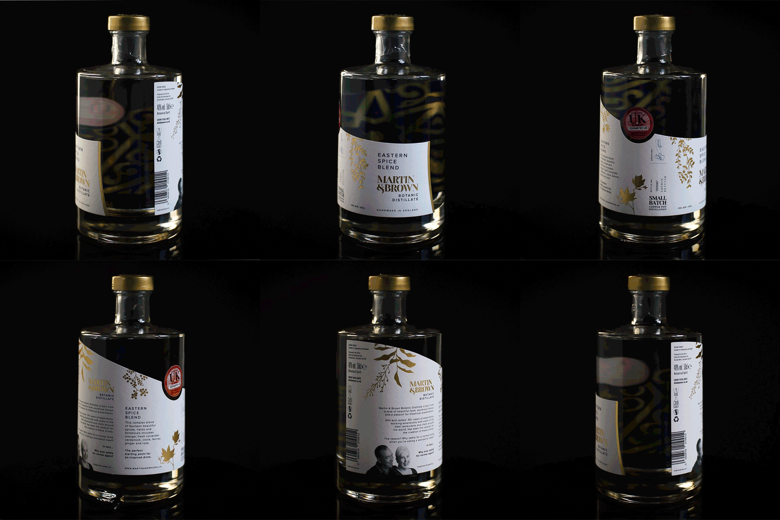
When you look at the bottle you are greeted by a sweeping label drawing attention first to the front. With its textured craft material highlighted with premium copper-toned foiling, it looks and feels high-end.
Your attention is captured by rich dark blue and gold patter which is actually from the print on the other side of the bottle on the underside of the label. Visible through the crystal-clear contents, the richness of the design is highlighted by the product itself. On top of the aesthetics, each label was sequentially numbered giving this limited-edition bottle even more added value.
“We really threw the rule book out of the window with this project! Combining a multitude of intricate processes shouldn’t work (in theory) for a host of reasons, but we had the knowledge, expertise and knew it would work. The end result was incredible!”.
Paul Humpage
CS Labels Sales Director
Would You Recommend CS Labels
“Yes! Overall, CS were easy to work with and we felt fully supported. Everyone loves our labels – they are extremely memorable.”
Kim Martin-Brown
Martin & Brown Founder
To find out more or to order yourself a set of these stunning bottled botanics, please visit https://www.martinandbrown.uk/ or follow them on Twitter.
For information on the designer involved, visit https://thebrandchap.com/ or follow Adam Thorpe via @TheBrandChap on Twitter.
Have A Question? Get in Touch:
Award Winning
Continues Research & Development
Zero-to-landfill Company
Leading Xeikon UK Digital Print Specialist
